Breaking the Static Mold: How Qantm Creative Uses Motion Graphics & Animation to Bring Brands to Life
August 14, 2025
Each year, Pantone, a global leader in color standards, names a “color of the year”. This color often influences creative trends and fashion throughout the year to come. Inevitably, the selection also generates a lot of opinions! So, we asked the members of our Creative Team what colors they would have chosen as the 2026 Color of the Year! Check out their selections below!
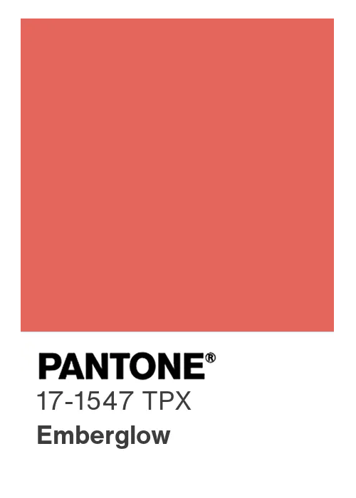
“I chose Emberglow because it feels like exactly what the world needs right now. It’s a warm, red-orange tone that brings a sense of comfort, energy, and optimism at a time when people are looking for something uplifting and real. We’re seeing a shift back toward warmer, more human colors as a counterbalance to the cold, digital spaces we spend so much time in. Emberglow has a depth and richness that sets it apart from brighter oranges, making it feel elevated but still approachable. Overall, Emberglow captures a sense of resilience and forward momentum; a color that feels hopeful, grounded, and ready for what’s next.”
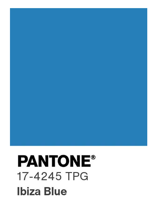
“Ibiza Blue is a clear, calming mid-blue that reflects the mood I think many of us are leaning into. I’ve always been drawn to blue for its sense of ease. You see it in the sky, the ocean, anywhere you look for a moment of quiet, and this shade instantly brings me back to the Mediterranean views I fell in love with in Sorrento, Italy. In a time when everything feels fast and a bit overwhelming, Ibiza Blue represents a collective desire for clarity, steadiness, and room to breathe. It feels like a reminder to stay grounded while still staying open, to let things flow rather than forcing them. Ibiza Blue carries that fresh, reset energy we’re all craving, encouraging a calmer, more intentional way of moving forward.”
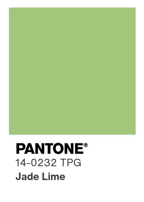
“Jade Lime is a fresh, botanical mid-tone that reflects the cultural direction. As AI expands at an incredible pace, Jade Lime represents our shared desire to stay grounded and to value what feels real, alive, and in the moment. I think we’re seeing a renewed focus on Romantic philosophy, with a growing interest in nature, softness, emotional depth, and a search for meaning that goes beyond the algorithm and social norms. Jade Lime expresses that return to organic beauty and also aligns with our current focus on sustainability in the face of innovation. It’s a color that feels like a reset and a reminder that progress and preservation can move forward together.”
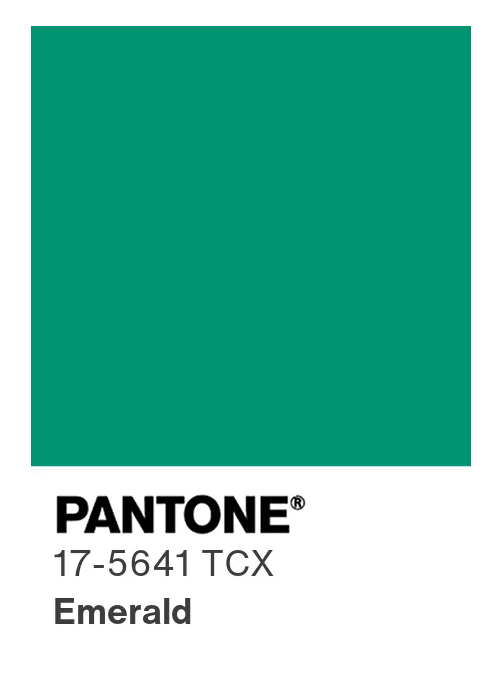
“While Emeraldgreen means many things to other people (the heart of the forest, the stone of transformation, a symbol of lush abundance and sanctuary, or an air of pure elegance), for me it is the mystery and enchantment that truly captivates. I love how Emerald holds the promise of hidden depths and unseen magic. It is not a shy color; it commands attention with its bold, confident look, making that sense of enchantment feel powerful and alive.”
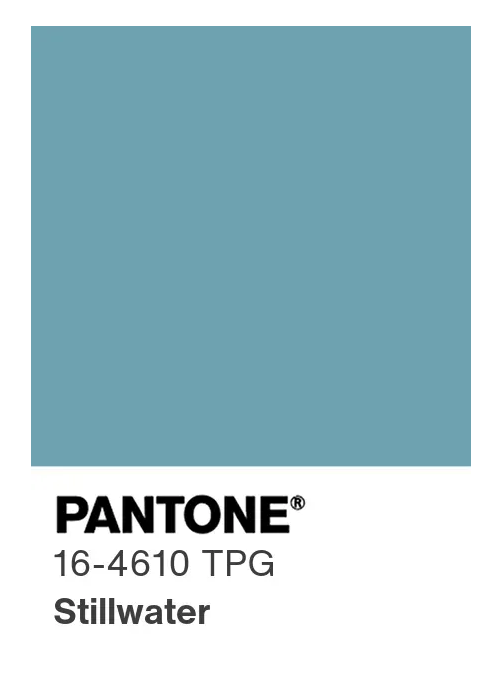
“This soft aqua-blue shade captures a sense of calm and clarity in a time when the world feels noisy and fast-moving. As we head into 2026, with people craving a break from constant change and digital overload, a soothing blue-green like Stillwater brings a much-needed sense of stability and ease. It aligns with the growing focus on mindfulness and wellness that’s showing up in everything from peaceful home decor to calming app interfaces. On a deeper level, colors like this are known to reduce stress and create a tranquil atmosphere, making Stillwater a fitting reflection of a collective desire for balance and mental clarity.”